Tri-Fold brochures are a great marketing tool. They sit on the counter, serve as a small, portable and inexpensive way to market your services. More than a business card, they give you ample space to talk about the features and benefits of your products and services.
Many people go to a website to get information about your services and having a downloadable version of your brochure can be a way for people to take information away, much like they would the hard copy from the counter. The problem is, when tri-fold brochures are provided electronically, they're great for printing, but pose significant accessibility problems. Even when they're created in a manner that can be read and navigated by someone using assistive technology, the reading order is wrong.
Think about holding a brochure. You're holding it looking at the cover, open it right to left to reveal the inside. To the left is the back of the cover and there's a flap on the right. As you open that flap on the right to see the three panel spread, the core of the brochure, the cover and the right flap are now the back of the document.
Now, look at the picture below. For a typical brochure folded like it's described above, when it's printed, the "back" of the document would be page 1 and the inside of the document, page 2. I've marked the order in which you'd read the panels.
However, if you're an assistive technology user who is not seeing this document, but hearing it. You're being presented information in an order that doesn't make sense. Instead of starting on the cover, you're hearing the second page, then the back of the brochure, then the cover. After that you get pages three, four and 5.
Even folding the document differently doesn't improve the readability or accessibility of the information. Using a z fold, you're presented with two back panels first, then the cover. After which you get the heart of the information on pages two, three and four.
So, question is, what to do. It's truly quite simple. You offer alternate versions of your brochures on your website. Allow people to download a portrait version of your information that's formatted like a regular document to be read from top to bottom or a tri-fold brochure version. Both versions can use the same information, graphics and style, but the portrait version ensures that information is presented in a logical manner whether the user is looking at it printed, on a computer screen or hearing it read to them by assistive technology. (Be sure to follow other accessibility standards when creating your documents).
The Commission on Rehabilitation Counselor Certification offers two versions of their brochure which explains what a Certified Rehabilitation Counselor is and does. In the screen capture below, you'll see that they offer links to the tri-fold CRC brochure and the full page CRC brochure, and have a single description for them.
To see the page where these are displayed, go to the CRC Resources page.
It's a simple and effective way to ensure that everyone can get your information in a clear, understandable, and accessible manner.
Brochure images adapted from Print-Print.co.uk blog
Tuesday, November 27, 2012
Monday, November 19, 2012
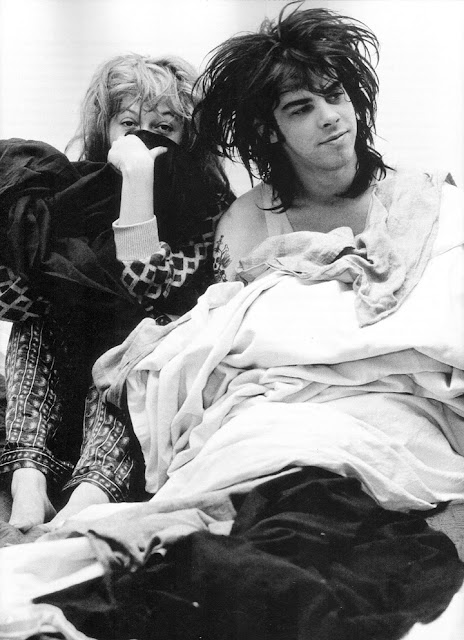
Nick Cave and Anita Lane
Alt: Nick Cave looking off camera right while laying down leaning against Anita Lane who is sitting with knees up and partially covering her nose and mouth and looking directly at the camera
For Brian via Perfection of Perpexion
For Brian via Perfection of Perpexion
Monday, November 12, 2012
Billy Idol (vulcan salute) and the Beastie Boys
Labels:
Adam Yauch,
Beastie Boys,
Friedman,
photography,
spock,
Star Trek,
vulcan
Subscribe to:
Posts (Atom)


